Category Archives: Personal work

G&B BOX!

HEY! I made the box for Green and Blacks!

It took a lot of brain work, even for me, but I did it! I used a thin piece of card because it was easier to fold.
It even pulls out like I intended it too! Just need a bit for the chocolate and i need to print a voucher off for the back, but it’s all done : )
Shame I wont be presenting it, but me and my partner have better ones to show..


Green and Blacks – Box net

Cool, so I made this today for the brief from Green and Blacks, basically this is the net for the Direct mail box which will contain a free sample..

I’ve still gone along with the stamp idea, and have now included a bit about the brand, and the ingredients of the chocolate on the back of the box. I have also used jungle images from their website to help make the box stand out and look less boring.

The box on the right of the net is for the voucher.. which I will stick on when I’ve made the box up.

It would be nice to here some suggestions to make it better or some comments saying it’s good or not etc : )


YCN – Boost


BME App

Just some development work really..  App for iPhone and Android.

Type in a British artist or band, comes up with tour dates and information on that band..

Gives directions to the museum, and tells you new installments and how to get involved.


New Boost ideas


Boost – YCN

Above is my original boost idea!

It’s a Polaroid of a person upside down, pulling a confused/tired/strange face.. the tagline ‘What you need to turn yourself around’ says that if you drink Boost, you become more awake and able to ‘turn yourself around’ for the day ahead. The campaign is targeted at any target market, except the extreme young and extreme old, because of the people who are in the pictures. I tried to do some images on Photoshop and this is how they turned out..

Other ideas I have to improve these, is to take my own photos, with people I know, people faces, maybe having the hair look like it’s falling downwards. Remove the Boost can and just have the logo stamped on the ad, I’ll post the final results, but these are what I have so far.. just some development work. Need to do a whole lot more to them! BRING IT ON!


BME – Music board

Music board for BME. Decided to stick it on Bus stops near where the museum is based.
Still needs a lot of work, but this is it so far. I seem to be getting better at Photoshop, I’m just teaching myself as I go along so far, It’s pretty good.. Still loads more to learn though!


Green and Black – YCN

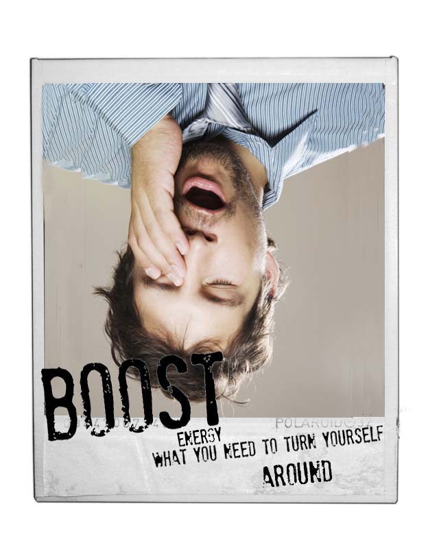
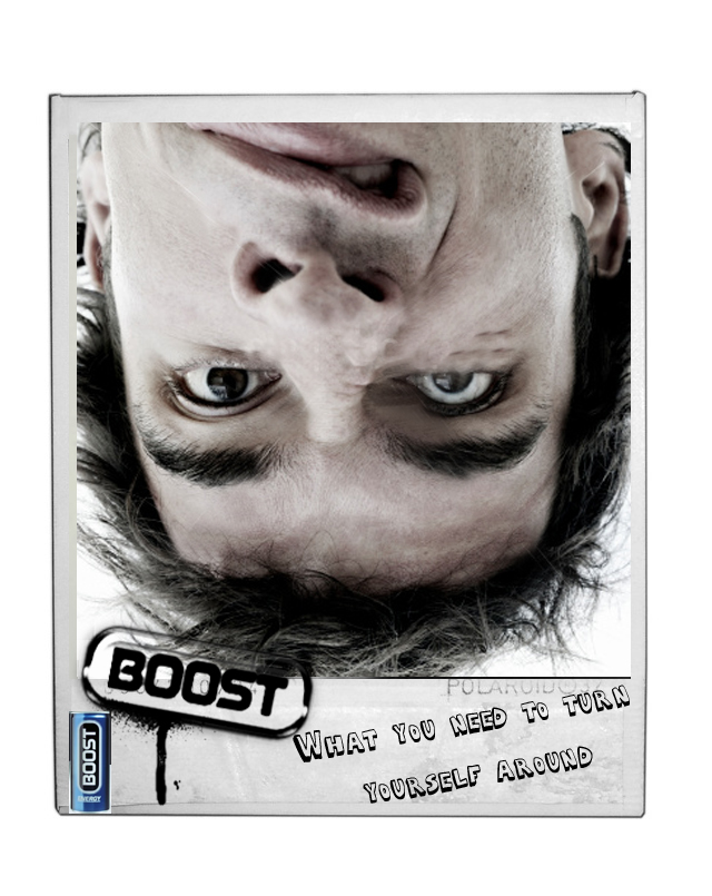
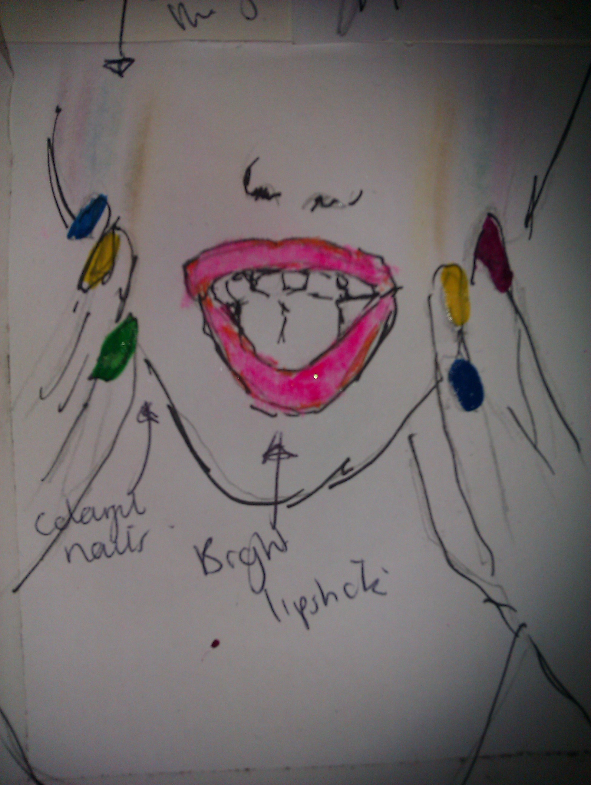
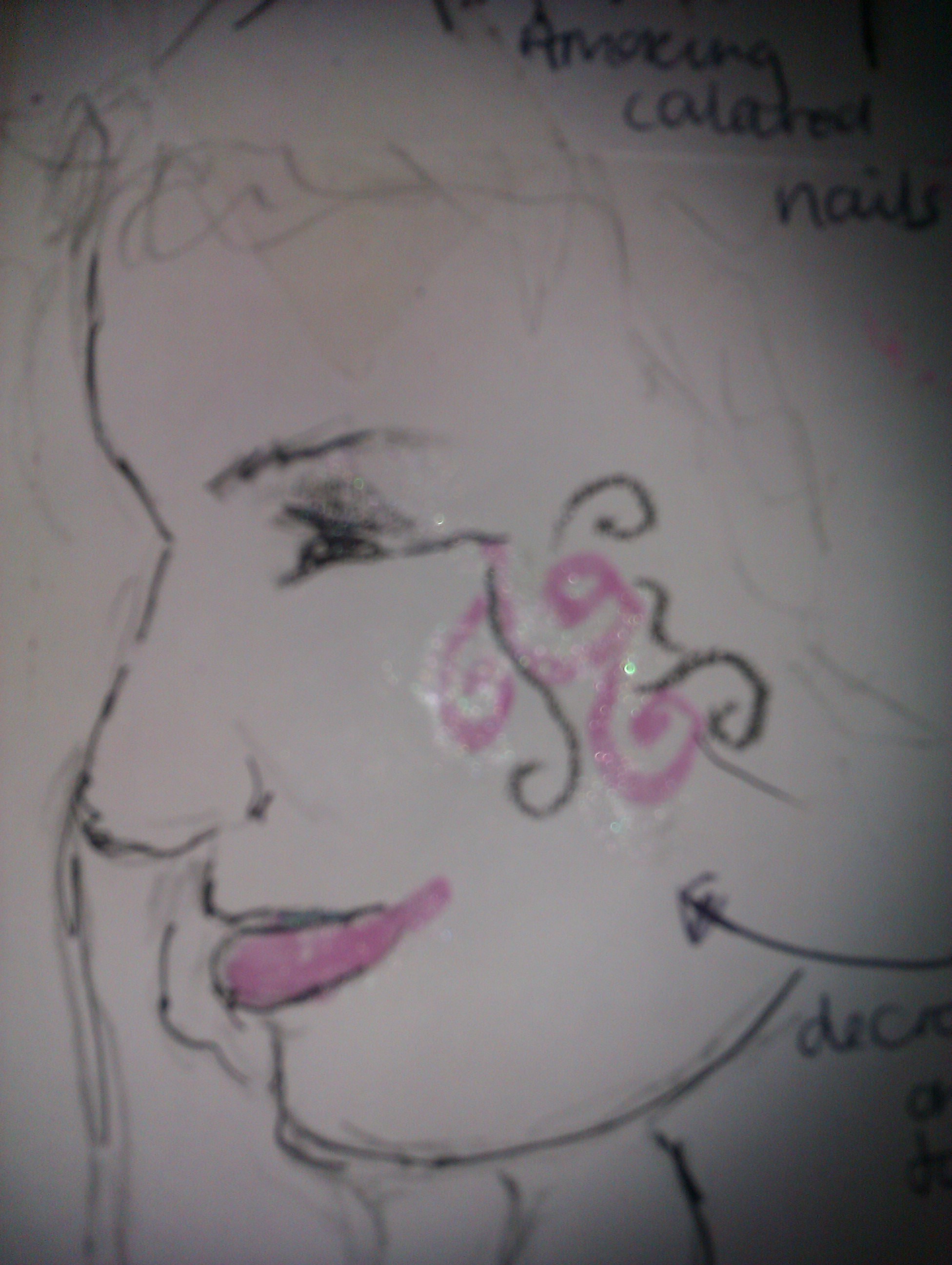
This is another brief I’ve done for YCN.
Green and blacks!  http://www.greenandblacks.com

I found this brief alright, I enjoy coming up with ideas and brainstorming some ideas for adverts. After reading the brief I saw a part of the information was based around tasting, before you buy. Which led to me coming up with a ‘free sample’ campaign.

I drew a couple of ideas out but none seemed to be what I was looking for. After tons of research and stuff. I found relating the chocolate to 1st class stamps seemed acceptable. The relevance being..

1st class stamps cost more than 2nd or any others because of the quality of delivery. Green and Blacks chocolate costs more than any other chocolate because of the quality of how it’s been made and how it tastes. I wanted to relate the campaign to price because I feel it is the most controversial subject in the world right now.

Above is a poster idea I had and below is a free sample ‘direct mail’ post I came up with (again relating to post and price) The sample contains a free sample of the chocolate ..
“Historically we’ve found that getting people to taste  the chocolate is more likely to get them to buy the brand” – words from Green and Blacks.

The idea of the sample is that it’s something to be amazed at. You pull it open, it’s fun to have and it contains a treat. There will be a voucher on the back to tempt any future buyers.

This is the net for the free sample and which elements will be printed on it.

Hope you likey : )


YCN Briefs


This is an idea, developed from previous ideas I will post later on. This is from one of my YCN briefs which I chose to tackle.. So far it’s been really fun to do. Obviously this poster isn’t finished yet.. Still needs things doing to it before the deadline on Friday. (This isn’t all I’ve done for  YCN, I’ve done like 2 other briefs, and a whole load of other stuff for BME. I’ll post that stuff later when it’s completed.) 
Overall today has been a very successful day. Great feedback from my lecturers this afternoon which boosted my confidence just a little bit. Now I have to work extra hard this week, to make them look amazing! Till next time!


Spitting?

These are just some quick poster ideas for something we really hate and what really annoys us. We chose spitting because It’s just horrible. These are two out of 10 ideas we had.. Einstein spitting, seems pretty surreal aye? (Spitting makes a smart arse, look like a dumb arse)


Portfolio – Start


Decided to start my portfolio. This is the title page for my photography section 🙂 It’s totally me, with its colours and stuff!


Converse long copy advert


Thought I would focus on the rough style that Converse create, and that you are like what your shoe is like. They say a lot about your personality and what you like doing, your converse is a part of you.


BME logo design

This is a design I did for the YCN brief for BME – British Music Experience.

I used the headphones because it’s music related and the Union Jack associates it with Britain, I hope to include these in any future BME designs.


This is an advert I created for Starbucks, The copy isn’t that great! Before you start saying it’s shit.. but the concept is there..

We also did some others.. involving the types of people who use Starbucks as a means of escape or something.

The manic mums
The social students
The business baldy (Above)
The lonely lady

We did an ad each for these groups and we also did a long copy for http://www.starbucksgossip.com. Show you that on a later post.


CV

My CV template : )  Need to fill it in with all my amazing information.. But At the moment it looks like this!


Creative CV

Just three Ideas for my Creative CV.. I want to do a little pocket sized handbook, and these are just three of the front covers I have designed.


This is a logo I design for my friends band called ‘Kilkovec’ I design the ‘K’ in paint, then modified it in Photoshop. The Logo was asked to look punk like, but not overly punky, so I used a font from Dafont.com, where it looks like it’s been stamped. The background is grey tape, just to bring contrast to the black font and the brown of the logo.


Trip to London 2008


Click them to make them bigger..


Photography A level


More photographs I took for my Anti fashion project, for these I used a digital camera.. sorry for the quality I took the pictures from pictures from my journal.


Photography A level

These are some images I took for a college project for photography A level back in 2008, The theme I chose was Anti-Fashion, using objects which are not usually associated with fashion, like the guns and messy hair, and unconventional clothes. I used a film camera, and developed them in a dark room, where i feel gave them a good look. They’re meant to be blurry, it’s not my crappy camera skills, I just felt this helped with the unconventional feel.


Uv continued.. Again.


I posted these photos a while back, but realise they were hard to see so here we go! I posted them again, these were the initial ideas for the Barry M adverts, for these I used real Barry M product to make them look interesting and just to get a clear idea of how the make up would look. After these ideas we began researching into UV which we found to be quite a niche market in terms of make up. You can see the final adverts if you scroll down. Or just click here, and it’ll take you straight to them.. https://jammerzann.wordpress.com/2011/02/15/uv-adverts/

Like I also suggested earlier.. I would create a viral to accompany the UV print ads.. The pictures aren’t clear but you can see briefly what my idea is. I will make a better copy on layout paper some time this week.


Doodles


The designs on the relentless cans are amazing, I copied the ‘R’ and decided to make a ‘B’ in the same type.. I used Biro for them both, and I know they look a bit rough, but i was only doodling. I just love how relentless has such a different brand to other drinks in the same category.


Some font we made a while ago, for a word we were given.. The word was photograph, we chose to use pixelated letters, recycled from photographs to get the authentic feel.


These are some print ads I created while waiting for half 2 so I could go to the cinema. No jokes. I know the fonts aren’t all that great, but like I said, the concept is there, not the execution.


Barry M

In the process of designing some ideas for the Barry M make up range which has been our next brief set.

We have to come up with a completely new campaign for the brand..  Ideas so far.. Using the make up in a creative way, e.g colourful nails, designs the face.. In process of coming up with something right now.. Will blog back again with the final results.

And yes I am wearing  Barry M nail varnish : )


Self branding

I was going through a bad phase during the development of Self branding, hence the ‘not so good’ grade. If I had a chance I would definitely change everything, well everything that is except for this T-shirt I made, something which reflected what I wanted to be then, and what I hope I am now. My aim, if you like.

Last year wasn’t a good one for me, grade wise and confidence wise.. I feel however, the end of last year and the start of this have really been amazing, I’ve learnt a lot about myself and achieved things I never thought I could.

Here’s hoping the rest of the year will be just as good : )


Degree show competition

My ideas of the brief set earlier this week, by some guy called Bob. We were asked to design an A5 leaflet and arrow signs for the UCA degree show which will be held in June. The prize is £175, that amount would happily pay for my holiday.. It’s not the best, but I have plenty of time to work on it.. I used ‘paint’ and Photoshop.


From year one, our first attempt at www.yoursoapbox.com. We decided to tackle the idea of Tuition fees, we got too mad about it. FUCK FEES!

The fee situation is worse now, so I guess the video didn’t work.. But it was great to come up with such a controversial issue and bring it to life.

This is a monster I designed for the viral. Created on ‘Paint’. However it was too complicated for the stop motion effect.