
Category Archives: Group work


Boost – YCN
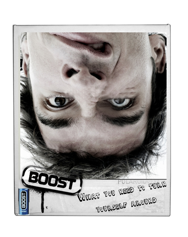
 Above is my original boost idea!
It’s a Polaroid of a person upside down, pulling a confused/tired/strange face.. the tagline ‘What you need to turn yourself around’ says that if you drink Boost, you become more awake and able to ‘turn yourself around’ for the day ahead. The campaign is targeted at any target market, except the extreme young and extreme old, because of the people who are in the pictures. I tried to do some images on Photoshop and this is how they turned out..


Other ideas I have to improve these, is to take my own photos, with people I know, people faces, maybe having the hair look like it’s falling downwards. Remove the Boost can and just have the logo stamped on the ad, I’ll post the final results, but these are what I have so far.. just some development work. Need to do a whole lot more to them! BRING IT ON!

Preview Post
 Preview of mine and my new creative partners long copy brief, due for Monday of next week.
UV adverts
Today I drove to uni half an hour before I normally left to get there for nine, to sort out finals images.. However, I still got to uni at the same time I normally do. Half 9.. It just doesn’t make any sense! Well anyway, These are the adverts we showed in class today.. Some of the feedback was quite good, maybe making a viral to accompany the print ads would work quite well.
I’ve attempted a viral storyboard, which I’ve drawn up in my reflective journal. I will put it up here tomorrow most probably. Also the tagline needs a lot of work to appeal to the correct target market, but overall the execution was okay and the point was made.


UV continued..
I’ve made some Print ads for Barry M’s UV range of make up and a few taglines which my creative partner for this brief and I have come up with..
The current tagline for Barry M is: ‘The most colourful name in cosmetics’ we decided to change this and add to the more night time UV culture.. here’s some of our ideas for taglines:
- Make every night beautiful
- The colours of the night
- Dare to be different
and some others, which are too crap for here.. At the moment I’m just going to post the pictures my creative partner took for this brief.. They’re amazing! And totally what I visioned them to look like.. After some photoshopping I made them a bit darker, and uped the contrast to maximize the bold colours.


UV Makeup
My creative partner and I wanted to go down the route of using UV makeup to stand out against Barry M’s current adverts, which are very cliche and average. As the tagline is “The most colourful name in cosmetics” We thought that this was a good route to follow. Our plan is to create a three poster and one ambient campaign whereby models are posed in seductive poses wearing this UV makeup.. The idea is to capture the attention of the reader in a different and exciting way.


After doing some research on UV makeup and Googling some images, I found these three pictures. The idea is to create something similar but holding the Barry M name, logo and tag line, somewhere within the advert. Also we plan to make the pictures much more colourful and vibrant just like the brand itself. Hopefully the images will turn out professionally and look amazing, which i’m sure they will.. : )
Our ambient advert is currently undergoing work, but we’ve come up with a concept of which I think is strong and could work against these print adverts. Basically it involves UV lights and a wall, with the words “Barry M: The most colourful name in cosmetics” graffitied on it in UV paints. However, I will sketch out the ideas possibly today or tomorrow and post them on here.
Barry M
 In the process of designing some ideas for the Barry M make up range which has been our next brief set.
We have to come up with a completely new campaign for the brand.. Ideas so far.. Using the make up in a creative way, e.g colourful nails, designs the face.. In process of coming up with something right now.. Will blog back again with the final results.
And yes I am wearing Barry M nail varnish : )
Debating
 Debate about the toilet situation in London, Waterloo, I decided to post he question on Facebook to get feedback for our presentation that we presented to Tony and Gareth yesterday. Some of the points raised I think are quite relevant and I guess quite funny ‘That’s why people pee on the streets of London‘.
I wrote this hanging like a bitch. Good night though 🙂
The end of the beginning.

Oh well, didn’t get the placement. This gives me more determination to do well in other things and achieve great and brilliant experiences else where.
This news concludes the experiential unit in year 2. I’ve really enjoyed working on this uni, with, what only I can describe as one of the best groups I have ever worked with. We worked well as a team and came up with some creative and fascinating ideas. Gutted it’s ended now, but hey, you can’t have everything.. Life goes on as they say.
Would you pay to use the toilet?
Over the last week or so, my creative partners and I have been discussing the issue about

paying for uses of Public toilets in Waterloo station, London. As students we feel
this is unnecessary due to the number of travellers these days paying extortionate amounts of money for their train ticket. When even some trains do not even have toilets on board, the worst thing to do if you’re busting for the toilet is to find any loose change you might have in the bottom of your bag or in your pockets. Would be nice to here what you think on the matter..?
This campaign was froma brief given by our Lecturer, for the publishing vompany Mills and Boon, who make eroctic book for middle aged women.
My group and I decided to research the website, looking at the different web pages for inspiration. The facts page particulary inspirered us and from there we created a ‘book design theme’ using calligraphic font type and pink colouring, like that shown on the Mills and Boon website.
Personally the campaign could do with some work, whereby the quotes used could be spiced up a bit, to capture the attention of potential readers. But the concept I think is a strong one.
Tech (nical)
 ‘Tech‘, our representation of the consumption of technology in society, was our idea for the Costa Alentejana brief we were given way back in September, this was probably one of the most stressful and exciting briefs so far on the course, mostly because it was a full on live one. My group and I (Janine, Danny and Sulaiman) Had so many different ideas, and thought the best one was this, we spent days making the sculpture out of chicken wire, mod-rock and A LOT of recycled materials. The sculpture represents how much us humans rely on technology and how much it can take over our lives, seeing as Costa Alentejana is a place were signal and technology is irrelevant we thought this would be a great route to follow.
We presented our idea to Jose on the 17th January 2011, he liked it very much, meaning we became one of the four finalists to win a placement with Bloom Consulting in Madrid. One week has gone by since Jose presented our ideas to the client in Portugal. I just want to know!
