
Monthly Archives: February 2011
CV
 My CV template : ) Need to fill it in with all my amazing information.. But At the moment it looks like this!

Left brain: I am the left brain. I am a scientist. A mathematician. I love the familiar. I categorize. I am accurate. Linear. Analytical. Strategic. I am practical. Always in control. A master of words and language. Realistic. I calculate equations and play with numbers. I am order. I am logic. I know exactly who I am.
Right brain: I am the right brain. I am creativity. A free spirit. I am passion. Yearning. Sensuality. I am the sound of roaring laughter. I am taste. The feeling of sand beneath bare feet. I am movement. Vivid colors. I am the urge to paint on an empty canvas. I am boundless imagination. Art. Poetry. I sense. I feel. I am everything I wanted to be.
Virgin Media
Father wears his Sunday best
Mother’s tired she needs a rest
The kids are playing up downstairs
Sister’s sighing in her sleep
Brother’s got a date to keep
He can’t hang around
Our house it has a crowd
There’s always something happening
And it’s usually quite loud
Our mum she’s so house-proud
Nothing ever slows her down
And a mess is not allowed
I remember way back then when everything was true and when
We would have such a very good time such a fine time
Such a happy time
And I remember how we’d play simply waste the day away
Then we’d say nothing would come between us two dreamers
Our house, in the middle of our street
‘Virgin Media, A more exciting place to live’
Creative CV


 Just three Ideas for my Creative CV.. I want to do a little pocket sized handbook, and these are just three of the front covers I have designed.
 This is a logo I design for my friends band called ‘Kilkovec’ I design the ‘K’ in paint, then modified it in Photoshop. The Logo was asked to look punk like, but not overly punky, so I used a font from Dafont.com, where it looks like it’s been stamped. The background is grey tape, just to bring contrast to the black font and the brown of the logo.
Green Day – Macy’s Day Parade
The song shows how we look for bargains and get so consumed by materialism that we forget about the one thing that makes us human.. feeling.
It then gradually flows into a story of growing up and realising that you have to make hard decisions and even though you go through lies and disappointments, you’ll have to move on. You’ll never get everything you want, and in the end you’ll see that all you really need is hope.


Photography A level


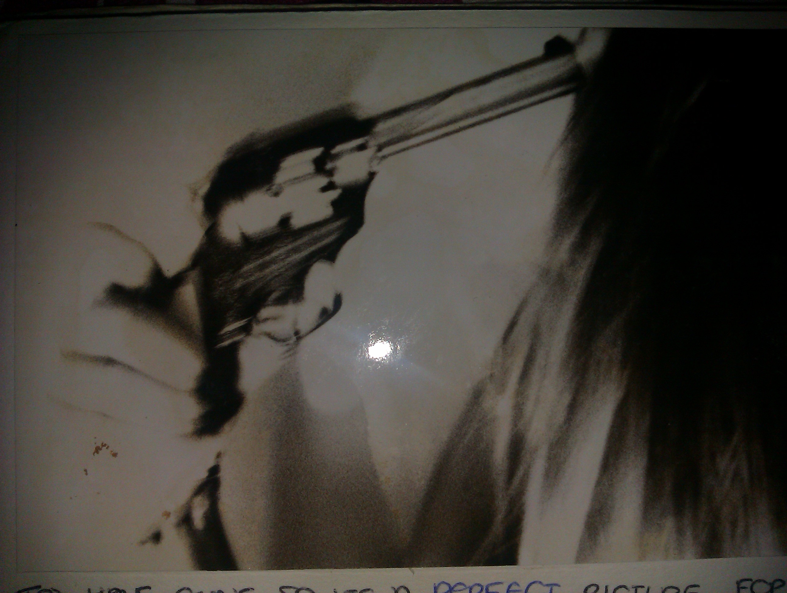
More photographs I took for my Anti fashion project, for these I used a digital camera.. sorry for the quality I took the pictures from pictures from my journal.
Photography A level


These are some images I took for a college project for photography A level back in 2008, The theme I chose was Anti-Fashion, using objects which are not usually associated with fashion, like the guns and messy hair, and unconventional clothes. I used a film camera, and developed them in a dark room, where i feel gave them a good look. They’re meant to be blurry, it’s not my crappy camera skills, I just felt this helped with the unconventional feel.

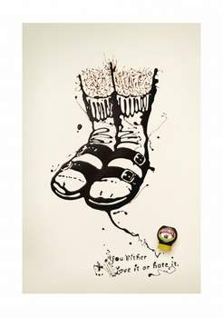
Squeezy Marmite Adverts


Do you love or hate squeezy Marmite? YES! and I love these squeezy Marmite adverts, they make me laugh.. First one.. Do you love or hate socks and sandals? Or do you love or hate mullets? personally I think they’re both awful!
Uv continued.. Again.


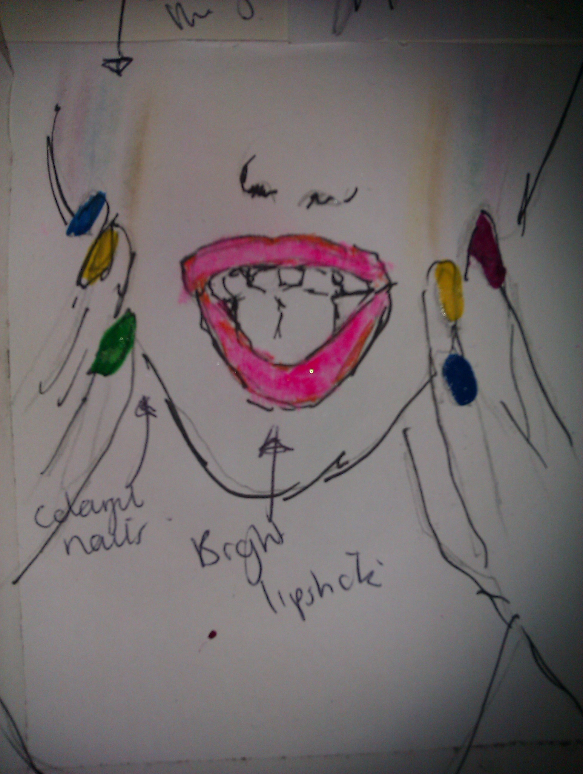
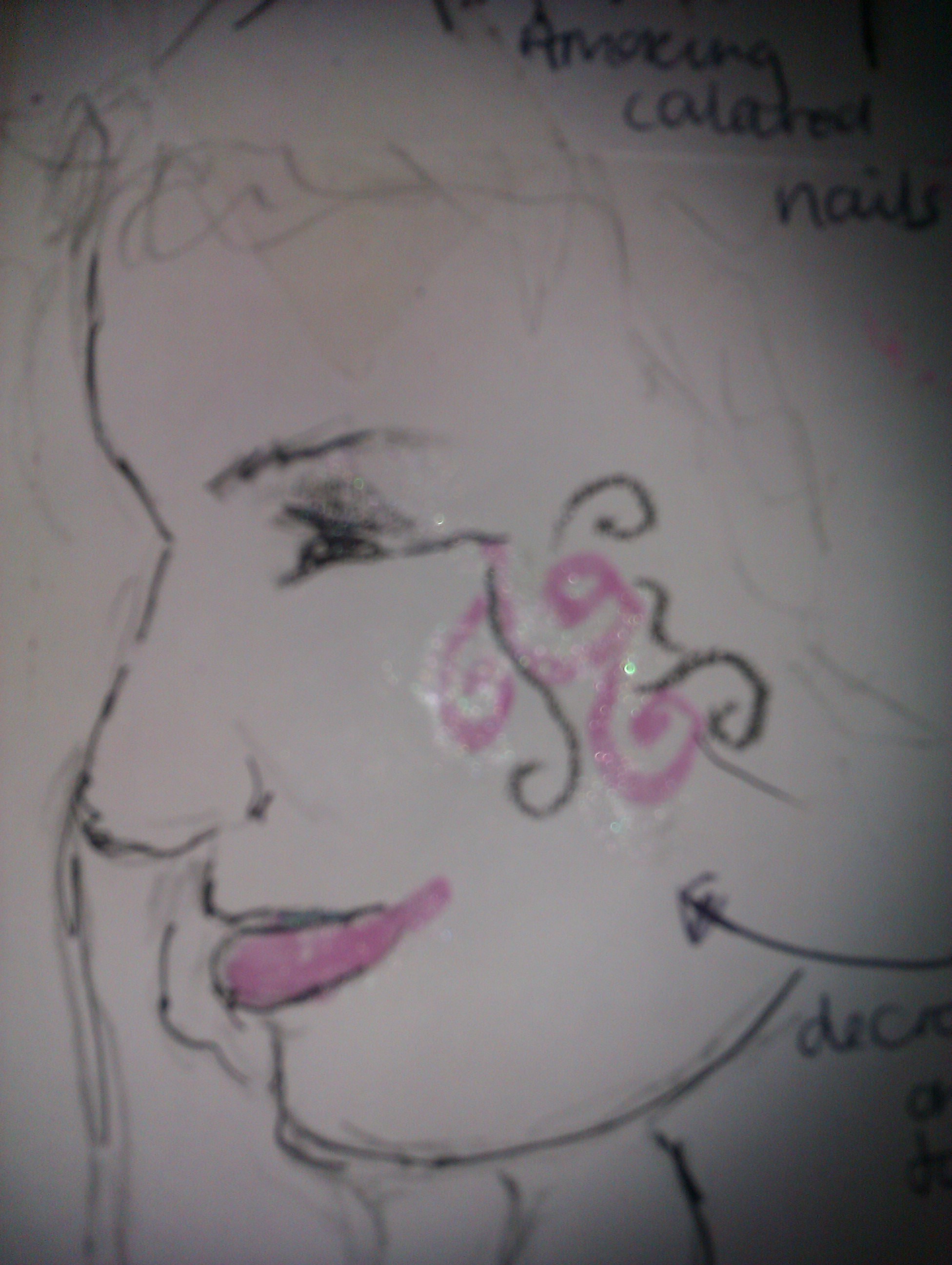
I posted these photos a while back, but realise they were hard to see so here we go! I posted them again, these were the initial ideas for the Barry M adverts, for these I used real Barry M product to make them look interesting and just to get a clear idea of how the make up would look. After these ideas we began researching into UV which we found to be quite a niche market in terms of make up. You can see the final adverts if you scroll down. Or just click here, and it’ll take you straight to them.. https://jammerzann.wordpress.com/2011/02/15/uv-adverts/
Like I also suggested earlier.. I would create a viral to accompany the UV print ads.. The pictures aren’t clear but you can see briefly what my idea is. I will make a better copy on layout paper some time this week.


Doodles


The designs on the relentless cans are amazing, I copied the ‘R’ and decided to make a ‘B’ in the same type.. I used Biro for them both, and I know they look a bit rough, but i was only doodling. I just love how relentless has such a different brand to other drinks in the same category.
 Some font we made a while ago, for a word we were given.. The word was photograph, we chose to use pixelated letters, recycled from photographs to get the authentic feel.

Preview Post
 Preview of mine and my new creative partners long copy brief, due for Monday of next week.

These are some print ads I created while waiting for half 2 so I could go to the cinema. No jokes. I know the fonts aren’t all that great, but like I said, the concept is there, not the execution.
UV adverts
Today I drove to uni half an hour before I normally left to get there for nine, to sort out finals images.. However, I still got to uni at the same time I normally do. Half 9.. It just doesn’t make any sense! Well anyway, These are the adverts we showed in class today.. Some of the feedback was quite good, maybe making a viral to accompany the print ads would work quite well.
I’ve attempted a viral storyboard, which I’ve drawn up in my reflective journal. I will put it up here tomorrow most probably. Also the tagline needs a lot of work to appeal to the correct target market, but overall the execution was okay and the point was made.


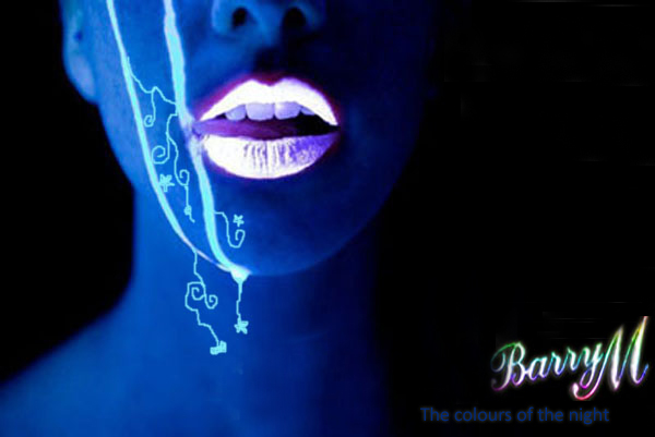
UV continued..
I’ve made some Print ads for Barry M’s UV range of make up and a few taglines which my creative partner for this brief and I have come up with..
The current tagline for Barry M is: ‘The most colourful name in cosmetics’ we decided to change this and add to the more night time UV culture.. here’s some of our ideas for taglines:
- Make every night beautiful
- The colours of the night
- Dare to be different
and some others, which are too crap for here.. At the moment I’m just going to post the pictures my creative partner took for this brief.. They’re amazing! And totally what I visioned them to look like.. After some photoshopping I made them a bit darker, and uped the contrast to maximize the bold colours.


Album art
So yeah, theres just something about album art which I LOVE! well, in some cases yeah.. some of it’s just shit.

After looking through some of my albums, I came across a few which I really like, me being a loser n’all.
1. Yeah first up definitely has to be a Green Day number, Dookie. I LOVE Green Day and I love this album cover, in my own opinion it just screams out COMICS, and CHILD-LIKE! I love it, totally up my street. So much is going on which also means you have to spend time looking at it which is good, because that’s more time admirering its amazingness.. (fully deserving of the made up word)

2. No offence to The Used fans, but not my favourite band in the world.. I love the typography on this album cover. it’s strange, (like myself) and different, and yeah, different always a good thing! The type is simple yet bold enough to make a statement and to me it suggests rough and ready, while added mystery.. The wispy lines give it a enchanted feel I guess which is reinforced by the chair, kind of like Alice in Wonderland, but a bit freakier. Maybe I’m analysing the type too much, but I don’t care, it’s my blog (smiley face)

3. Number three on my pointless yet fun countdown of great album covers is this beaut by Theory of a Deadman, an album I found stuffed under my bed and only God knows how long it’s been under there for! But after listening to it again, I’ve regained some love for it. So again with the type, it’s kinda western, backing up the colours the albums in, the musty yellows and browns, ya know the cliche of all westerns! The dude with the black wings signifies the album, he’s a deadman, so give the deadman some wings! Nice rough look, which I strangely seem to like in album covers, probably gives the albums a nice sense of belonging and wear.
4. I’m all for the rough and ready and this Yellowcard album is right up my street, I know it probably isn’t for you, but I like this whole, photography ‘Hey lets fiz it up with some sellotape’ malarki..
 That’s enough of the obvious background, bu I also think the yellow is a bold colour to use, and probably a good idea hence the YELLOWcard, but still I think it looks good against that rough background I like so much. The trees.. probably of some place that’s nice and significant to nothing, but still a good idea, and helps reinforce that look I keep mentioning.
So that concludes this thrill ride of album covers chosen by me.

